The Man, The Mascot, The Moustache – The Many Faces Of Mario
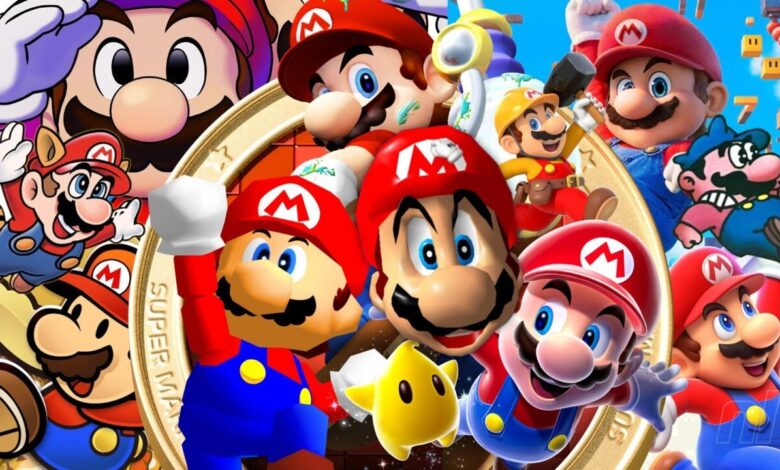
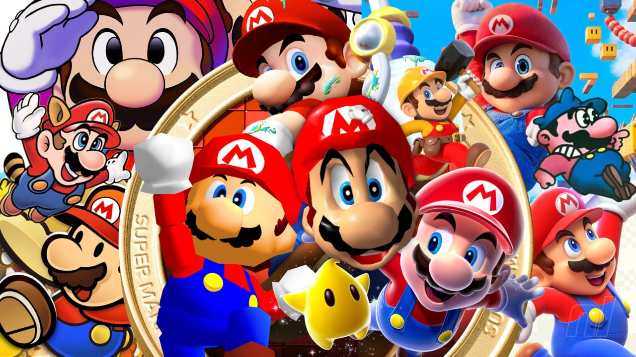
The early days of video gaming saw the birth of so many iconic characters, console stars that endure to this day. Amongst that early litany there is, of course, Super Mario. Mario Mario to his friends. Who would’ve thought 100-odd squares would one day become one of the most recognisable characters on the face of the Earth? He’s changed over the years, sure, but never strayed too far from that classic, early design.
So, with Mario & Luigi: Brothership on the horizon, featuring a shiny new in-game model for the main man to boot, we’re casting our eye back to chart the voyage of his visage. We’ve given the same treatment to his oldest rival and his fiercest competitor previously – so it seems only right that the portly plumber should receive the same service.
We’re focusing mostly on his main in-game appearance and promotional art that goes alongside each entry (much as we love his All-Stars tuxedo, his many, many other guises could fill up multiple articles), using these to define different eras of his design.
First stop, the ’80s.
Arcade accolades (1981-1984)
Though he wasn’t the titular character, Mario was certainly the hero of his first outing – starring in the insanely popular and genre-creating platformer Donkey Kong in 1981.
Creatively named ‘Jumpman’ at the time, his design on the side of the machine and the promotional material is a little… off. Are his feet broken? And does that nose belong to Wario or Mario? At least his colours and overalls are present – albeit swapped around.
‘Arcade Mario’ is essentially a retcon of Popeye, so these oddities can be forgiven. The rubber hose influence is clear here (this wouldn’t feel out of place in Cuphead) and carries through to a couple of years later, when Mario’s name finally graced the cabinet. A little softer, a little plumper, and decidedly more ‘Mario’ in essence – the cabinet artwork for Mario Bros. felt key in laying the groundwork for his appearance in the future.
But what about the game sprite itself? In both cases, remarkable – to be frank. For their time. As clear as day in terms of matching up with the art and expressive with their movement. His nose may be a little more nobbly than it is these days – if only they’d shorn one pixel off the end and he’d be a dead ringer for what we’ve come to expect now.
Pixel-y perfect in every way (1985-1992)
The advent of Nintendo home consoles brought new Mario games and with it – a new design for their mascot, starting with Super Mario Bros.
Tragically for players in the US and UK, in place of Yoichi Kotabe’s gorgeous illustrations their box art featured a blown-up sprite, bafflingly in his white fire flower overalls. Accurate, sure. But not exactly endearing. (Box Art Brawl voters agree). Japan and continental Europe however saw the emergence of what we consider the ‘Classic Mario’ design. The inward shifting white-blue-black eye rings with built-in eyebrows, the soft round nose, the brown-hair-black-‘stash combo, and most importantly of all, the now renowned ‘M’ adorning his hat.
All the early design concepts of ‘Arcade Mario’ come together here, augmented with sublime touches that moves the character from the everyman protagonist to the instantly recognisable hero. There’s also a shift away from rubber hose art, grounding him in reality a little more (well, as realistic as fighting giant turtle dragons can be). We couldn’t tell you how many times we drew this face and loved it because it was easy to draw. Always a bonus for a mascot.
Though his promotional art stayed pretty consistent throughout the NES and Game Boy era – his sprite developed wildly in the space of only a few years. Super Mario Bros. felt like a bigger, bolder version of his arcade sprite. Softer nose, more detailed hair – but largely the same. Very square. But Super Mario Bros. 2? Now that’s a different story – in more ways than one.
It may be a reskin of a different game but the love and care that went into Mario’s sprite is astonishing. There is a notable shift in his body and head position. When stood still Mario’s body leans more into the game world instead of facing straight out, and his head is shifted just a little more toward the player – allowing us to see both of his eyes, which now feature white instead of being one block colour!
The difference is night and day, truly reflecting what we see in the artwork. Much rounder. And though Super Mario Bros. 3 undoes some of this fine work by removing the whites of his eyes, it added a brilliant ‘waddle’ animation that gave him more life than ever. SMB3’s box art also has the distinction of solidifying the last design detail – a red shirt and blue overalls (well, black in the game). At last. Mario proper has finally arrived.
At this juncture, we were thinking about including the Super Mario Bros. Super Show, but we feel like it’s trying to be consistent with what existed at the time, even if it falls a little short. And the SNES era’s World and All-Stars largely carry on with ‘Classic Mario’ – with some lovely 16-bit shading adding some depth to the in-game sprite.
However, the SNES does provide us with two significant titles which throw up some wild innovations and variations.
Baby Park (1992-1995)
1992’s Super Mario Kart was a revelation, not only in terms of gameplay and birthing one of the biggest gaming franchises in existence (its successor is the best-selling Switch game by a Mario Circuit mile), but also how we saw Mario in-game.
Though Super Mario Kart’s characters are sprite-based, the models have a pseudo-3D effect, allowing us to view Mario and indeed most of the Mushroom Kingdom inhabitants in full 360 degrees. Seeing him on the character select screen as if he were a solid, tangible, person-shaped person left us giddy at the time.
1995’s Super Mario World 2: Yoshi’s Island is gorgeous – and though Yoshi is the star, Mario is ever-present. We may have some beef with Nintendo’s baby versions of their mascots, but there’s no denying they’re incredibly cute – and ‘Baby Mario’ is instantly recognisable here due to his trademark hat. Really, only because of the hat. And his nose, perhaps.
The whole game has a more cartoony aesthetic than we’d seen previously and we bring it up as little elements from that – Mario’s block black eyes, for example, appear again later on down the line. But that aside, this is still very much a mainline iteration of Mario.
Aside #1: Playing with power
What’s that I hear? “We’ll jump to the N64 now, as Mario’s first 3D appearance was in the mid-’90s, right”? WRONG!
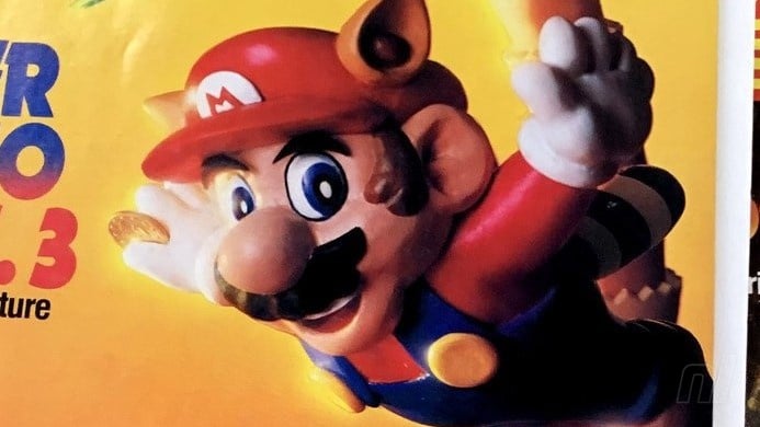
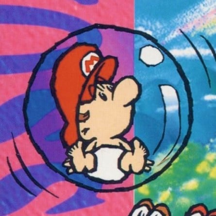
The old and crusty amongst us will remember the official Nintendo Power magazines and their absolutely bonkers clay models of Mario. These range from the nightmarish, trippy Super Mario Bros. 2 model with his just plain wrong black boots and buttons, to the sublime Super Mario Bros. 3 racoon Mario soaring through the sky – fully on-brand.
These left such an impression they even made a reappearance in the final issue in 2012. Take the time to have a gander at this early push into modelling Mario – it’s fascinating to see a 3D model reflective of his 2D design of the time.
The big jump, man (1996-2001)
Everything that could be said about this leap in gaming has already been said, and even then it really was a moment of awe firing up Mario 64 that cannot be fully explained to those who didn’t experience it. Mario’s big, round face zooming in to view, his eyes following a cursor that also let us stretch his squishy nose around. It was magic.
Nintendo leaned hard into the polygons, forgoing the previous hand-drawn art style of its promotional materials to show off their 3D model and, by extension, birthing ‘3D Mario’.
By its very nature, this made Mario’s official appearance less cartoon anime and more model-like. From this point, increased texture detail on his clothing or strands of hair would define each console generation.
Sunshine Superman (2002-2015)
The jump in power with the GameCube meant Mario’s in-game model could now replicate his promo-appearance self much better, and this is the point where we start seeing only incremental changes to his design.
There were still impressive moments of course – seeing his lifelike jeans appear from the smooth model during the opening of Melee was a standout moment, but this basic template was the standard for a long time, through the Wii and Wii U eras, whether he was dressed up in a cat suit or construction overalls.
We did see the return of ‘Classic Mario’ in the icons and stamps for 3D World but these were very much a throwback. Even the return to sidescrolling games in the ‘New’ series used a 3D model in all its promotional material.
By this point his design is so iconic that it’s hard to make any sweeping changes – but to their credit, Nintendo did mix it up a little here and there.
Aside #2: Another dimension? (2000-2016)
Well, a return to a previous one would be a more exact title. Remember those block black eyes we mentioned from Yoshi’s Island? They made a return in 2000’s Paper Mario. A sketchy callback, you might think, but one we can’t help but fold in.
This was a departure from the gameplay we expected from a Mario game and the design is reflective of that change. It feels like a glorious mish-mash of his previous incarnations. Very plump, a bit rubber hose and with thick black borders highlighting his knuckles and outline – this is an exaggerated Mario and the most cartoony since his arcade days.
His in-game model stays close to the premise, eschewing fluid movement for deliberate takes on what a paper Mario might do – bobbing as he runs, having a static body as he spins that ends up flat when sideways, the detail that went into it is so satisfying. Consistent now across this series, ‘Paper Mario’ became his own unique character.
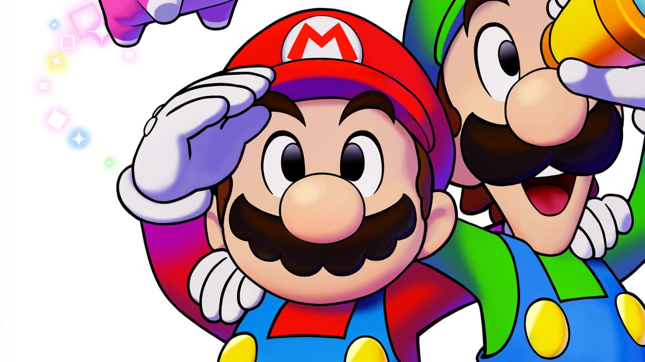
A mere three years later saw another new 2D design as part of the Mario & Luigi series. We wish we could talk about Luigi’s stripy socks here – but this article is long enough already.
Curiously, this design feels like a hybrid of ‘Classic Mario’ and ‘Paper Mario’. It keeps him more in line with his proportions and shape of the former while utilising things like the simplicity of the eyes and thick outlines of the latter, though it does them a little differently. The borders aren’t quite so harsh as ‘Paper Mario’ and the eyes are somewhere in the middle – white and black with no blue. The movements of his sprite, too, are unique to this version and somehow out-cartoon ‘Paper Mario’.
We may go so far as to suggest that ‘Mario & Luigi Mario’ is the most whimsical and expressive. Huge facial expressions and a wibbly wobbly body leaning into the cartoony nature of the design makes him truly his own, formidable design entry.
Modern Mario (2017-present)
Remember when Mario’s nipples broke the internet? That’s a weird sentence to write, but it’s even weirder that it’s basically a fact.
Since the Switch’s arrival, we’ve seen all of the above designs in their latest stage (bar Arcade Mario – poor guy). The promo material for Odyssey used a lot of Classic Mario for a heady nostalgia hit in conjunction with the fancy 3D Mario we’ve become accustomed to. And said 3D model has developed so much that we were obsessing over a single grey hair.
Mario Wonder injected more Yoichi Kotabe-inspired, cartoon-style personality into his in-game iteration than ever before, but the basic design remains essentially the same. His appearance was given only the slightest of tweaks in Ubisoft’s + Rabbids games and his various sporting appearances, too.
‘Paper Mario’ has his Switch entries and is the iteration that has stayed largely the same – no bad thing given how bang-on it was from the start. The biggest leap we’ve had on console is ‘Mario & Luigi Mario’. The trailers for Brothership have been utterly gorgeous. It’s a testament to this new interpretation of the design that there aren’t really any notable changes to point out – it feels perfectly realised from those early 2D days and we love the goofiness.