Box Art Brawl – Duel: Contra 4

Be sure to vote in the poll below; but first, let’s take a look at the case designs.
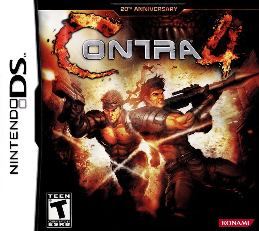
North America

We like the layout of the North American version of Contra 4. The logo looks great at the top, with the main characters Bill Rizer and Lance Bean posing nicely in the middle of the image. It’s quite dark overall, but we like how it gives the whole piece a bit of a somber atmosphere. It’s great.
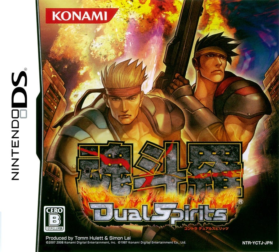
Japan

The Japanese version, in which the game title is Contra: Dual Soulstakes a more stylized approach to character design. It doesn’t quite venture into the anime world, but it’s certainly close. It’s a little brighter than the Western version in general, but again, there’s a bit of a darker tone to the colors used here.
Thanks for voting! We’ll see you next time in another round of Box Art Brawl.


