Brawl: Mega Man Zero 3 Box Art
Be sure to vote in the poll below; but first, let’s take a look at the case designs.
North America
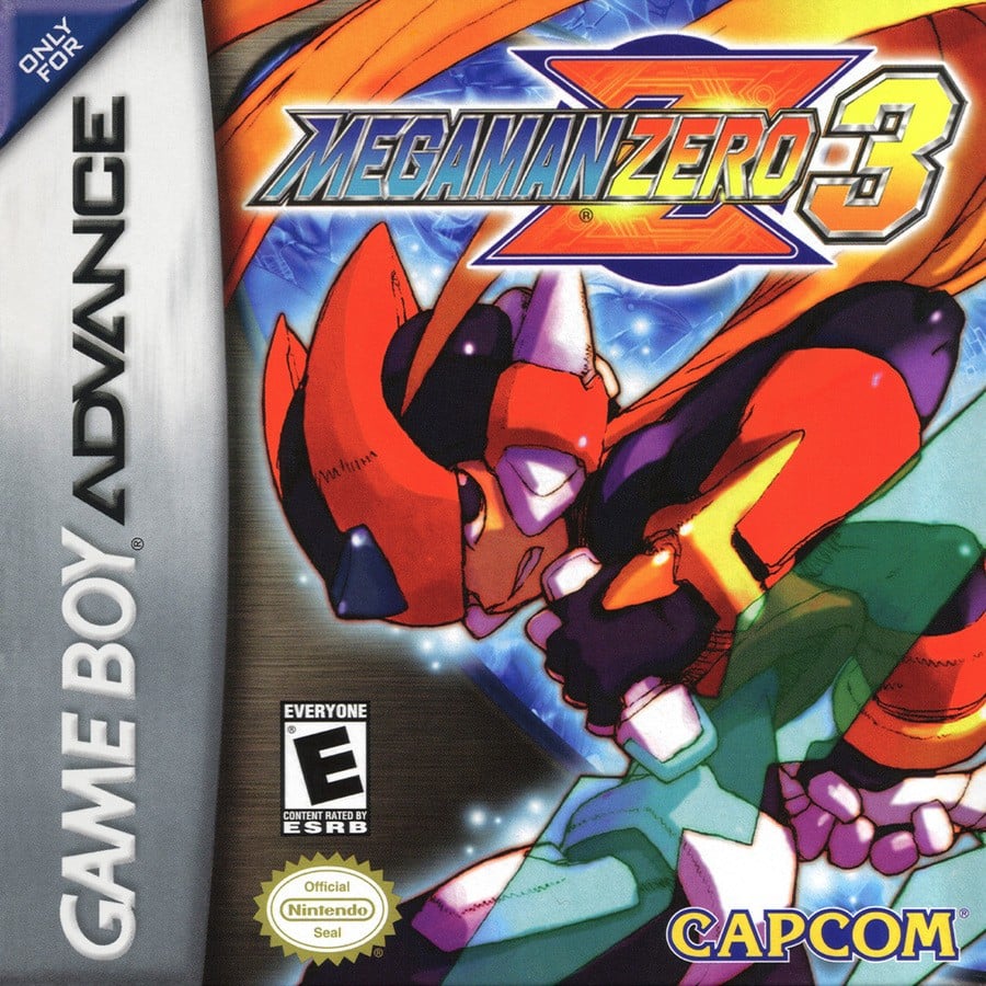
The North American design looks like the quintessential Mega Man Zero artwork, doesn’t it? It’s a nice layout, and our protagonist looks cool. The way his hair seems to cascade around the logo at the top is a lovely little touch.
Europe
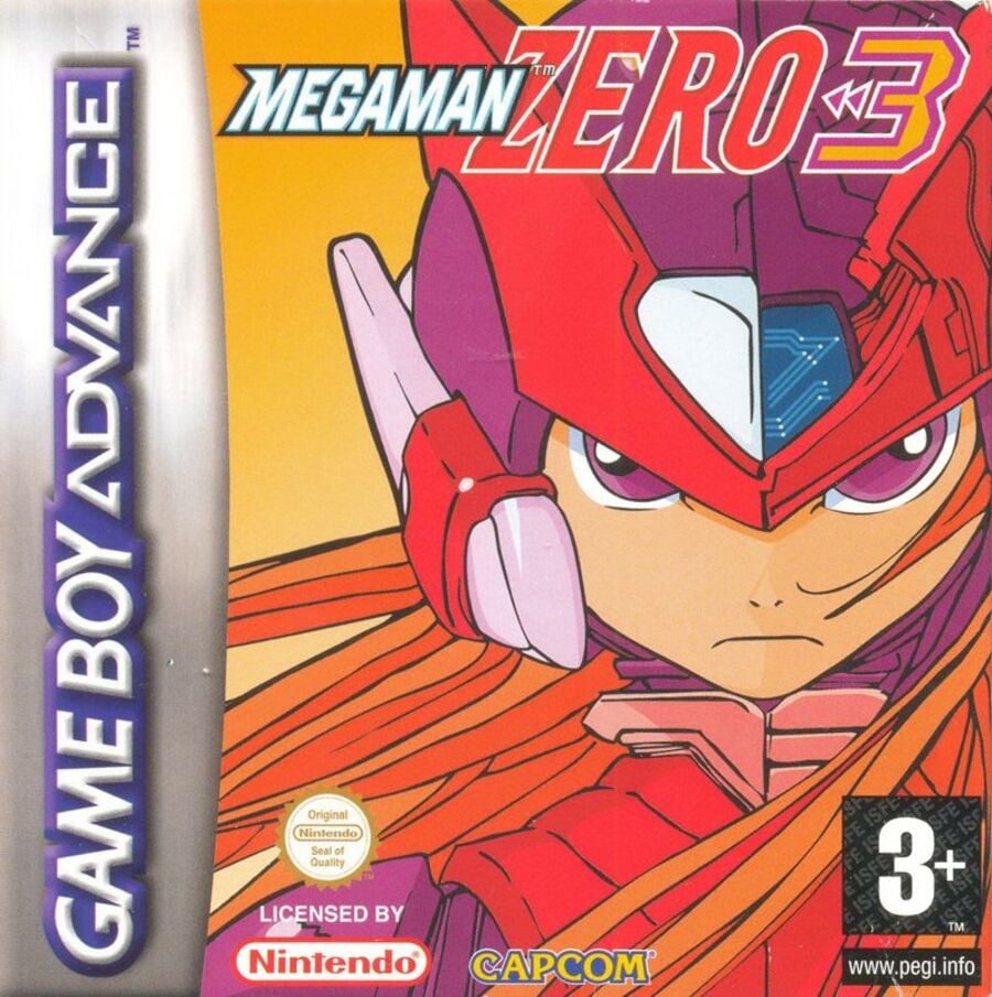
Okay, this… this… oh no…
Continue.
Japan
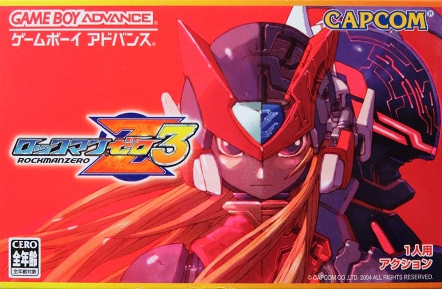
Okay, let’s go back to the European design for a moment. It looks like someone re-drawn the gorgeous Japanese version but didn’t do a very good job. This version is gorgeous and actually uses the landscape orientation used in Japan for GBA games. The colors are also incredibly bold; this version is a must have on the shelves!
Thanks for voting! We’ll see you next time in another round of Box Art Brawl.


