Reforged Launches on PS5 September 19 – PlayStation.Blog
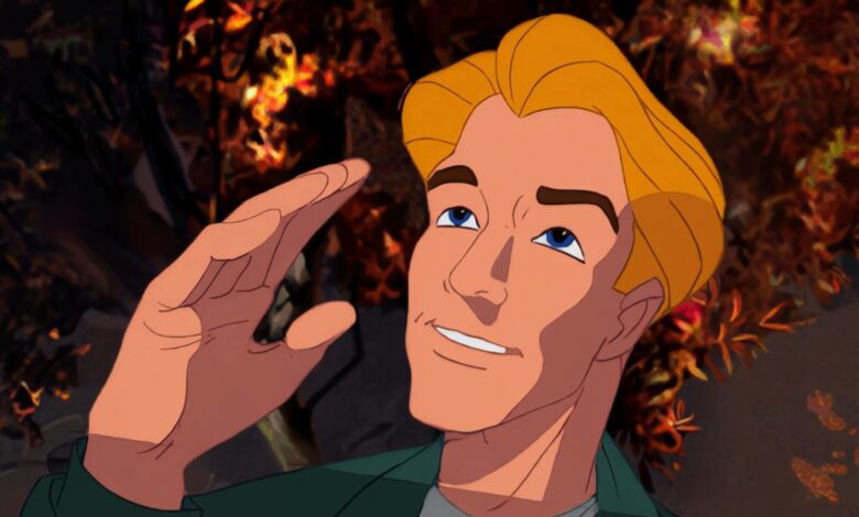
Many of the Broken Sword fans I meet today first discovered the series in 1996 when the demo for ‘Broken Sword – the Shadow of the Templars’ was included on the CD that was included on the cover of Official PlayStation magazine. I was delighted that the subsequent Broken Sword games continued to be extremely popular on the PlayStation platform.
A year or two ago, encouraged by the enthusiastic fan response that has continued over thirty years since, I decided it was time to make a significantly enhanced version of the game for PlayStation 5. We would be redrawing the entire graphics at 4K resolution – over 50 times the resolution of the original PlayStation version, and I was determined to ensure that the adventure gameplay was completely contemporary for the modern PlayStation audience.
With over 100 wallpapers and 30,000 animations, creating this enhanced version or Reforged would certainly be a huge undertaking.
The original backgrounds were hand drawn in pencil on A5 (or larger) sheets of paper by extremely talented layout artists who worked most of their lives at Don Bluth Animation Studios in Dublin. I decided that the ‘standard’ for the game should be those original pencil layouts, and when the game screens changed for whatever reason, we would build on the pencil layouts to create new high-resolution artwork. This allowed us to digitally redraw the original 4K art, which we had scanned at very high resolution, with the confidence of using the original game screens as reference.

View and download images

View and download images

View and download images
This means that there have been some changes where the original digital colourist took shortcuts – for example in the Paris Museum, the original layout artist drew a sphinx, but then the colourist opted to save time by using an image of a goddess – possibly adapted from a photograph. The high-resolution game screen now includes a sphinx as originally intended. We were caught out once or twice when we drew background elements from the original pencil layout, only to find that lines of dialogue referred to a different image that had been changed by the digital artist. At 4K, there is now scope for more detail, which makes the backgrounds feel really sharp and visually appealing, and also enhances the gameplay experience as the player can see more clearly what is relevant to solving the puzzle.

View and download images

View and download images

View and download images

View and download images

View and download images
The character animation sprites have been redrawn, referencing the original character sheets to recreate details that would otherwise be a mess of pixels at low resolution. Each sprite took our talented team of animators up to an hour to draw – often needing to improve animations that look great at low resolution, but don’t look so great at high resolution. But it’s totally worth it – it’s great to see super smooth animations, with subtle facial animations and expressions that look like great adult animation.

View and download images

View and download images

View and download images

View and download images
We decided to conduct user testing early in development to determine how the original point-and-click interface and overall user experience would be received by a new generation of players. While the reviews of the game in the press and from users were always great, we found that some new players were confused by the interface and found the gameplay frustrating when they got stuck. This caused us to completely rethink our approach. While the original Broken Sword was a huge innovation in the genre back in the 90s (the control system most adventure game developers use today is dubbed the ‘Broken Sword’ interface because that’s what they’re copying), we quickly realized that it was time to innovate again – some younger players simply weren’t enjoying a game experience that for many adventures simply hadn’t changed significantly in over 30 years. People play adventure games because they enjoy solving puzzles that move the story forward, and we were determined to make sure the experience felt great. So we looked back at the videos and comments from those users and redesigned the elements they were having trouble with. We iterated and resubmitted for testing multiple times, and each time we saw the user score increase until we got the high user score we originally hoped for. The HUD and user experience definitely feels much more modern and innovative now. We kept in mind that many people preferred the original approach, so we gave players the choice between the traditional approach and the new story mode.
I hope you enjoy this new version of the original game, Broken Sword – Shadow of the Templars: Reforged. We’ve built on a game that was wildly popular when it was first released in 1996, has retained a devoted following ever since, and is arguably one of the most popular adventure games of all time. I’m so proud of our amazing team who have continued their passion and dedication to create a game that delivers everything the original did, and more, in 4K.


